
What is a Yamazumi Chart? | Definition, Examples & Software
A Yamazumi chart (also called a Yamazumi board or operator balance chart) is a stacked bar chart used in lean manufacturing to show how work is distributed across the stations or operators on a production line. Each bar is one station; each segment inside it is a single work element with its measured duration; a horizontal line marks takt time, the pace customer demand requires. The name comes from the Japanese 山積み, meaning a stack or pile — describing how the work elements accumulate into a column. Because the segments are classified as value-added, incidental or waste, the chart shows more than which station is slowest: it shows what that station's time is actually made of, which is what determines whether the right response is to move work, change the layout, or remove the activity altogether.
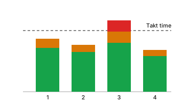
Anatomy of the Chart
- X axis
- One bar per station or operator, in process order.
- Y axis
- Cumulative time per cycle, normally in seconds.
- Stacked blocks
- Each block is one measured work element; its height is that element’s duration.
- Colour categories
- Colour separates value-added work, incidental work and waste.
- Takt line
- A horizontal line at takt time; any bar rising above it cannot meet demand.
See It Built
How to Create
- 1
Define the process and the cycle boundary
Fix where each cycle starts and ends and which stations belong to the line you are balancing. Without a fixed boundary the readings are not comparable to each other.
- 2
Break the work into elements
Split each station into small, repeatable work elements rather than recording one lump of time per station. Element-level detail is what later makes the chart actionable.
- 3
Measure each element over several cycles
Time every element across several cycles under normal running conditions and average the readings, so that a single slow or fast cycle does not set the standard.
- 4
Classify every element
Mark each element as value-added, as incidental work that is necessary but adds no value, or as waste. This classification is what turns a bar chart into a decision.
- 5
Calculate takt and stack the bars
Divide net available production time by customer demand to get takt time, stack each station’s elements into a bar, and draw the takt line across the chart.
To read it: any bar above the takt line caps the output of the whole line, so the tallest bar is where output is decided. Then look inside that bar rather than at its height — a station that is 90% value-added is genuinely full and work must move elsewhere, while a station carrying 20% walking and searching does not need work removed, it needs the waste removed. Finish by asking where the constraint moves to after the proposed change, because a rebalance that pushes the bottleneck one station downstream has achieved nothing. Modern tools such as Yamazo Studio build the chart directly from video time study data, so each segment stays traceable to the frames it was measured from.
The takt line is the one number the whole chart is measured against, so it is worth getting right before you stack anything — work out takt time for your own line.
Each block in a bar is one measured element, and the bar itself is the station cycle; if you do not have those numbers yet you can estimate cycle time from output and run time.
Example
A five-station assembly line runs against a 60-second takt, with station cycle times of 42, 57, 78, 55 and 53 seconds — 285 seconds of total work content. Station 3 is over takt by 18 seconds, so the line paces at 78 seconds regardless of what the other four achieve. The chart makes the imbalance obvious, but the segments make it actionable: of station 3's 78 seconds, 14 are walking to a rack and searching for a gauge. Relocating both recovers those 14 seconds outright, and moving one 4-second element to station 1 brings station 3 to 60 and station 1 to 46. The line now paces at 60 seconds instead of 78 — 78 ÷ 60 = 1.3, so the same shift produces roughly 30% more units with the same operators and no new equipment. Balance efficiency, total work content divided by the number of stations multiplied by the longest station, rises from 285 ÷ (5 × 78) = 73% to 271 ÷ (5 × 60) = 90%. Note where the gain came from: deleting the 14 seconds, not moving the 4. Had the walking simply been reassigned to a neighbouring station, total work content would have been unchanged and the line would have gained nothing.
Explore Further
Standard Work Combination Sheet (WCS) | Definition & Template
What is Takt Time? | Definition, Formula & Calculation
Takt Time Calculator
OEE Calculator
Yamazo Studio for Automotive Manufacturing | Video Time Study Software
Yamazo Studio for Electronics Assembly | Video Analysis Software
Yamazo Studio vs UMT Plus | Video Time Study Comparison
Yamazo Studio vs Timer Pro Professional | Video Time Study Comparison
Yamazumi Software: Turning Measured Work Into a Balanced Line
Yamazumi Chart Examples: Five Worked Scenarios
Frequently Asked Questions
Take the template with you
We will email you the element time study template — station, element, category and five cycle columns, with worked example rows already filled in. The same email carries the Yamazo Studio demo links, in case you want to measure the same thing from video instead.